 |
| Data Interpretation Questions |
These questions are based on the information that is presented in the form of a graph, chart or table. Most of the data is presented graphically. The most common types of graphs are line graphs, bar graphs and circle graphs. The objective of such questions is to test your ability to understand and analyze statistical data.
Question Format
Data interpretation questions always appear in sets, you are presented with
some data in any format (chart, graph or table), and you will then be asked
with some questions about that data.
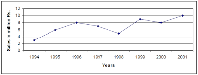
The following example explains the format of such questions.
Example:
Question 1:
What is the average sale, in million Rs., for the period 1994-2000?
(A) 5.5 (B) 6.0 (C) 7.0 (D) 8.0 (E) 8.5
Question 2:
For which year, the percentage increase in sales from the previous year is the greatest.
(A) 1995 (B) 1996 (C) 1999 (D) 2000 (E) 2001
How To Attempt
- Do not try to answer such questions immediately, first of all read the presented data carefully. You must be very clear about the data and its meanings even before reading the first question.
-
Do not confuse numbers with percents. This confusion is most likely to
occur when data is presented in pie graphs. For example in the
following graph

Now it would be a great mistake here to think that sales of “TVs & VCRs” is 15% more than the sales of Computers in 2001 by XYZ Corporation. To know this you have to calculate it as (15/25) x 100 = 60% - Try to avoid un-necessary calculations. Most of the questions could easily be solved by observation and estimation. Use estimation to eliminate the choices, if you are not able to find the correct answer without calculation. For example to solve “Question 1” presented in the example at the start of this section, if you are not sure of the correct answer, you can then try to cut down the number of possible choices by observation. You are being asked to tell the percentage increase. Where as, in year 2000, the sale is decreasing instead of increasing, so, you can immediately eliminate choice (D) in that question.
- Your answers must be based upon the information presented in the given charts and graphs. If your knowledge contradicts any of the data presented, ignore what you know and stick to the presented data. The presented data should be the only base for your calculations and estimations.
- Always use the proper units, there may be some questions that ask you to compare different data items possibly from different data sets. Be careful about the units used to represent the data.
- Because graphs and charts present data in a form that enables you to readily see the relationships among values and to make quick comparisons, you should always try to visualize you answer in the same format as the original data was presented.
- Be sure that your answer is reasonable. For example, the profit could never increase the actual sales, or the expenses could never be negative etc. While answering the question, first of all eliminate such unreasonable choices, and then choose from the remaining ones.


0 comments:
Post a Comment